A few months ago, I was doing a speed optimization audit for a lifestyle blogger who couldn’t figure out why her mobile site performance was sluggish. When I logged into her WordPress dashboard, I found a total of 34 active plugins.
One of the absolute biggest culprits was a heavy, bloated plugin used solely to display a tiny profile picture and a two-sentence biography at the bottom of her blog posts.
When I looked at the source code, that single author box plugin was loading its own tracking scripts, external font files, and massive stylesheets on every single link of the site. It was a textbook case of plugin bloat.
I deactivated the plugin instantly and replaced it with a simple, raw block of HTML and CSS. The visual layout looked identical, but her page loading speed immediately recovered.
If you want to keep your site fast and clean, you don’t need a heavy extension just to show who wrote your content. In this guide, I will show you exactly how to add author box in wordpress without plugin installations, using a simple, lightweight layout that works with any modern theme.
Why Skipping the Plugin Is Better for Your Blog
Whenever you can replace a plugin with pure code, you should do it. Most author bio extensions try to be everything for everyone, packing in social media feeds, tracking settings, and excessive styling files that your server has to load every single time a page opens.
By using a wordpress author bio code snippet, you get three massive benefits:
- Zero Impact on Speed: Pure HTML and CSS take less than a millisecond for a browser to read.
- Total Style Control: You can easily change the background colors, fonts, and borders to perfectly match your site design.
- Clean Theme Integration: It sits naturally inside your content container without breaking your mobile layout grids.
Step 1: Add the HTML Structure to Your Post
To build the box framework, we need to create the text structure. We will use a standard Gutenberg custom HTML container to place the author avatar, the name, and the short bio description.
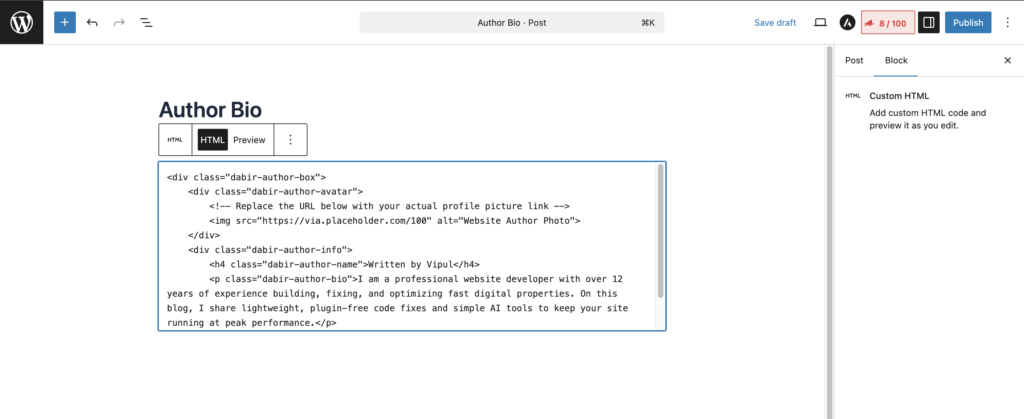
Create a Custom HTML Block right at the bottom of your post editor and paste this code:
<div class="dabir-author-box">
    <div class="dabir-author-avatar">
        <!-- Replace the URL below with your actual profile picture link -->
        <img src="https://via.placeholder.com/100" alt="Website Author Photo">
    </div>
    <div class="dabir-author-info">
        <h4 class="dabir-author-name">Written by Vipul</h4>
        <p class="dabir-author-bio">I am a professional website developer with over 12 years of experience building, fixing, and optimizing fast digital properties. On this blog, I share lightweight, plugin-free code fixes and simple AI tools to keep your site running at peak performance.</p>
    </div>
</div>
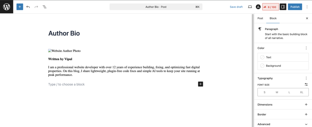
💡 Quick Developer Tip: Make sure to replace [https://via.placeholder.com/100](https://via.placeholder.com/100) with the actual image URL of your profile photo from your WordPress Media Library.
Step 2: Add the Clean CSS Author Widget Styles
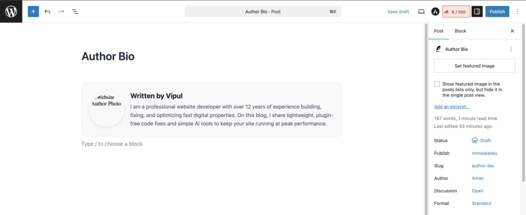
Now that our text structure is in place, we need to style it so it looks like a premium, professional widget. We will use a modern CSS flexbox layout that automatically scales beautifully on small mobile screens and wide desktop displays.
Add this stylesheet directly below the HTML block inside the same Custom HTML Block (or paste it into your theme’s Additional CSS panel):
<style>
.dabir-author-box {
    display: flex;
    align-items: center;
    background-color: #f9f9f9;
    border: 1px solid #e2e8f0;
    border-radius: 12px;
    padding: 24px;
    margin-top: 40px;
    margin-bottom: 20px;
    box-sizing: border-box;
}
.dabir-author-avatar img {
    width: 90px;
    height: 90px;
    border-radius: 50%;
    object-fit: cover;
    display: block;
    margin-right: 20px;
    border: 3px solid #ffffff;
    box-shadow: 0 4px 12px rgba(0,0,0,0.08);
}
.dabir-author-info {
    flex: 1;
}
.dabir-author-name {
    margin: 0 0 8px 0;
    font-size: 1.25rem;
    color: #1a202c;
    font-weight: 700;
    font-family: -apple-system, BlinkMacSystemFont, "Segoe UI", Roboto, sans-serif;
}
.dabir-author-bio {
    margin: 0;
    font-size: 0.95rem;
    line-height: 1.6;
    color: #4a5568;
    font-family: -apple-system, BlinkMacSystemFont, "Segoe UI", Roboto, sans-serif;
}

/* Responsive adjustments for smaller mobile screens */
@media (max-width: 600px) {
    .dabir-author-box {
        flex-direction: column;
        text-align: center;
        padding: 20px;
    }
    .dabir-author-avatar img {
        margin-right: 0;
        margin-bottom: 16px;
    }
}
</style>
How This Lightweight Snippet Works
Let me break down exactly what this custom code does so you understand how it maintains your website speed:
1. The Flex Container Layout
.dabir-author-box {
    display: flex;
    align-items: center;
}
Using display: flex aligns the author image and the text area side by side automatically. The align-items: center instruction ensures that even if your biography text is short, the image stays perfectly centered vertically next to it, creating a balanced look.
2. The Clean CSS Author Widget Mobile Logic
@media (max-width: 600px) {
    .dabir-author-box {
        flex-direction: column;
        text-align: center;
    }
}
This is a responsive breakpoint media query. The moment a reader opens your article on a smartphone screen narrower than 600 pixels wide, the layout automatically switches from a side-by-side view to a stacked vertical layout. The photo moves cleanly to the top center, and the text aligns neatly right beneath it, preventing any layout breaking or squished text boxes.
Wrap Up
Adding basic theme features doesn’t require flooding your database with plugins. By utilizing clean, raw code snippets, you keep your source code lightweight and ensure your site loads beautifully for your target audience. Try this out on your current theme layouts, and drop a comment below if you need help adjusting the background colors to match your current branding!

Vipul is a digital entrepreneur with a deep specialization in hardware optimization and web ecosystem management. With years of experience in the SEO industry and a passion for mechanical keyboard architecture, Vipul personally researches, tests, and writes every guide found on this site.